The numbers are very clear – customer experience matters.
It matters a lot.
It’s also one of the most common-sense formulas in business: satisfied customers who enjoy their experience equals more revenue.
So, why is it that so many SME websites look and function as if customer experience was the last thing on their mind? Also, how can SME owners improve the CX on their SME websites?
Let’s find out.
Why SME Websites Ignore Customer Experience
Anyone who has ever worked with small-to-medium enterprises on matters such as SEO, marketing, or web design will tell you that there are many reasons why these types of companies often put too little emphasis on customer experience on their websites.
For one, these types of companies (and the accompanying websites) are often started by industry experts who are not that familiar with the many nuances of marketing and especially customer experience. They believe that old line from Field of Dreams, “If you build it, they will come,” only to find out that the line may not hold as much truth as it does in the movie.
Other times, they simply don’t care that much. They are juggling so much stuff as part of their day-to-day operation that their website is often an afterthought, as in “It’s there, it (sort of) works, maybe we’ll get to it later.”
However, by far the most common reason why they ignore customer experience is that they are too proud of their product or service. In other words, their entire website is about what they or their product does and how well it does it. It is 100% product-centric.
Now, that’s a perfectly human view of things – you worked so hard on your product, you believe it to be great, and you want your customers to be aware of it. Unfortunately, not only is this bad for sales (as you need to put solutions over features to convince customers), but it also makes customers feel unimportant. This is not saying that you shouldn’t include your product’s features on your website – just don’t make them the focal point.
Now that the reasons have been covered, it’s time to talk about solutions.
How can you start prioritizing customer experience on your SME website?
Provide Answers Proactively
Many people think that the key to selling to your customers is to talk incessantly. Even some really good salespeople do this – they bury their customers under an avalanche of information, and they think they did a great job. In reality, their customers zoned out in the first 30 seconds.
The key is to let your (potential) customers talk; to guide them into asking questions. This way, you get to understand their pain points, and you can predict any objections that they will have (both consciously and subconsciously) in their decision-making process.
A well-researched and thought-out FAQ section can mimic this great sales practice. After a couple of conversations with your potential and existing customers, you already know what their most common questions are. You know the really important questions that they want to be answered before they make a decision.
This FAQ section from the Voices website is a great example:
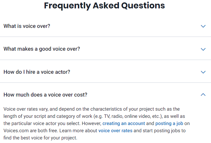
You can see immediately how they guide their potential customers to learn more about the service they provide and why they are the best choice. They even address the most common objection – the safety of the platform. They get in front of the potential customers’ questions, answer them, and save everyone a whole lot of time.
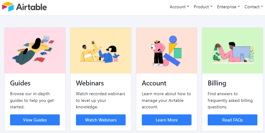
The folks behind Airtable have gone a step further with their proactive customer support. They have an entire subdomain dedicated to helping out their existing and potential customers. It is packed with all kinds of content (including webinars and guides), answering pretty much every question their customers might have.
That’s a good customer experience.
Let Your Customers See the Product In Action
You can show off what your product can do in many ways. For one, the “these are our 87459 features” approach is the equivalent of the aforementioned logorrheic sales approach. In 99% of the cases, people will get bored and, at best, skim the subheadings. At best.
Free trials (giving your potential customers a test drive) are also a popular way to show your product in action. They seem like a no-brainer solution, right?
Well, in many cases, they can be overwhelming, especially if there is no guidance for brand new users embedded in the free trial. People may feel lost, which makes them feel stupid, and no one wants to feel stupid. Also, free trials usually mean a significant time investment, and many people just don’t have the time.
Luckily, there are ways to show off your product in action without making it seem like a chore.
For example, Optimal Workshop, a user research tool, uses specially devised demos where they set up specific experiences for different customer personas. They show them what they can expect from their tools, but they do this in a toned-down manner without overwhelming people who try the demos. They even allow the demo users to see what it’s like to be on the other side of the research process.
Another way to engage potential customers is to make a part of the product free. Doing this provides a truly useful tool that builds awareness of your brand. It is also a matter of time before people start researching other (paid) tools that you offer. It takes some balancing to ensure your paid offer is attractive enough and well-advertised, but it can be done.
Quetext does this with their free plagiarism checker, while Ahrefs has a whole selection of tools you can use for free.

Provide Community Support
We all know the value of great customer support. It is the pillar of the vast majority of brands that do most of their business online. With serious analytics employed to sift through your company’s data from customer support interactions, you can even use it to grow your business.
That being said, customer support has one very obvious set of limitations: it is done by the people from your company, with the same training, the same solutions to the same problems, and the same narrative.
And that is perfectly fine. However, discerning customers are always looking for something more organic that makes them feel like part of a community.
Enter community support.
A community you build around your industry (not even your product) can be a fantastic way to provide additional industry information to your potential customers, increase their engagement with your brand, and, let’s be honest, build your lead database.
The folks behind the automatic repricing software Aura have built a staggeringly helpful Facebook group with more than 13,000 people who discuss selling on Amazon, repricing, and their software.
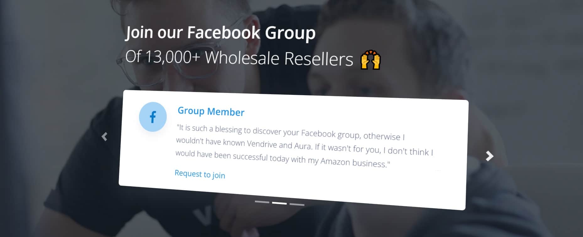
It took them a while to build such an active community, but it’s been such a great way to boost their customer experience that they feature the invitation to join the group on their homepage.
Genesys, an omnichannel CX platform, has even launched a YouTube Community Q&A Show where people from the company talk to the users with specific problems and work them out on air. It must be a lot of work, but you can’t deny that it’s an engaged community of people who feel that the company is focused on them and their experiences.
Simplify Checkout. Simplify checkout. Simplify checkout.
The year is 2022 (when this article was written, in case you are reading it in the future) and, believe it or not, there are still innumerable SME websites whose checkout process takes seven screens and 20 minutes. It would be bad form to name and shame those companies, but they are out there, and we all know that.
From a purely CX standpoint, this is pretty much the worst thing you can do. You have actually managed to get someone to purchase your product or service and, all of a sudden, the final step turns out to be climbing Mount Everest. You are shooting yourself in both feet, knees, and an artery or two.
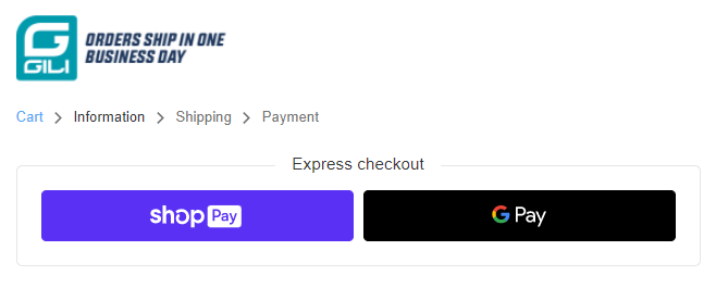
There is really no reason to do this in 2022. For example, check out how simple Gili Sports makes it.
As you can see, you don’t even have to be logged in to make a purchase. They just ask for your shipping information, and that’s it. Even the express checkout option makes it even simpler to finish your purchase.
Another great example is Omega, keeping it as pared-down as possible.
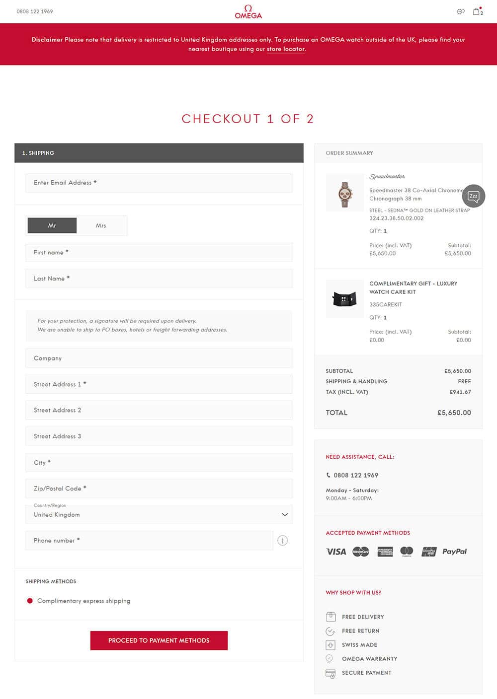
They do, however, make sure to point out that you will need to sign for the delivery once it arrives. At those prices, it’s expected, but still, they make sure everyone’s on the same page.
Besides asking the customers to do the least amount of work as possible, there are a few more tricks you can employ to make their checkout experience better:
- Use auto-fillers – Put the zip code at the top of the address section and let an auto-filler put in the city/state/province/country/etc. automatically.
- Pre-check options – Most people will choose the cheapest shipping option. Precheck it for them.
- Reinforce trust – Let your customers know their personal data and payments are secure. Make it very visible.
- Don’t spam – Do not try to sell them 74 more products in the sidebar + three pop-ups + the footer + the header with a super-extra-insane offer.
- Give them a choice – Include as many payment options as you possibly can, even if you’ve only recently heard of them (at least research them).
Crafting the perfect checkout experience is equal parts art and science, but if you want your SME website to be better CX-wise, you have to put in the work.
Be Smart About Upselling and Cross-Selling
This is a subject that has been touched upon in the previous section, but it can have such a detrimental effect on CX (when done wrong) that it deserves more attention.
Upselling and cross-selling are the bread and butter of a savvy salesperson as they have a much bigger ROI than landing a brand new customer. These are people who already know your brand, who trust it, and who use your product. With them, 99% of your sale is already done for you.
However, handle that remaining 1% poorly and you will not only fail to make an up sale or cross-sale but also alienate your customer and leave them with a feeling of the worst customer experience they could imagine.
The easiest and most effective way to avoid this is to simply put yourself in your customers’ shoes. It can be a difficult brain exercise, especially when you are invested in your products/services, but you have to do it. You have to clear your mind of everything YOU know about your products and assume the point of view of your average customer.
Then, start asking yourself some of the following questions:
Do I really need that bigger plan? Do the additional features really make it worth it?
Am I being attacked by special offers from all sides? Am I not allowed to simply buy and use the product I bought without being spammed?
Do the recommendations I am getting really make sense, or are they a product of a cheap, poorly-trained recommendation engine?
Is this website just spamming offers because they want to sell more stuff, or are they thinking about my needs?
Is there any context for these offers? Do they get me?
If you’ve managed to distance yourself from your product and website, honest answers to these questions will tell you what kind of an experience you are providing to your customers when it comes to upselling and cross-selling.
This product page from Rain or Shine Golf is a good example of what happens when someone thinks long and hard about their upsells.
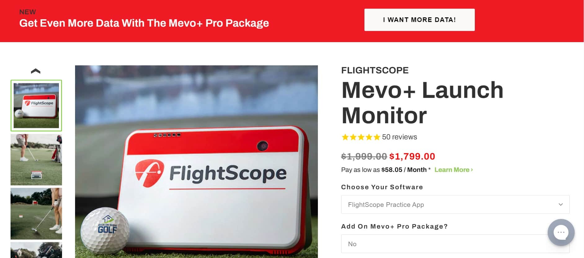
The upsell is the I WANT MORE DATA! button.
At first glance, it does not look like the most subtle attempt at upselling in the world, right?
In fact, they are doing a great job here.
It makes sense – the upsell is featured on a product page for a similar but cheaper product with fewer features. It tells you exactly what you will get from an upgrade – more data, which is important for people who use golf simulators to improve their game. It is the feature that matters to the target audience. This upsell understands them.
If you visit the page, the only other upsells and cross-sells are the necessary ones you need to use this product. They are not trying to sell you water bottles or golf apparel. It is all contextual. That is a good customer experience; all it took was some common sense.

Closing Word
Remember, this is just a start. These are the things that will work on a subconscious level, telling your customers that they are not just data in one of your dashboards. It will provide your SME website with a more human touch that goes a long way in today’s world.


