In 2018, someone launched a GoFundMe campaign on Kylie Jenner’s behalf asking people to donate to help her become the youngest self-made billionaire. Now you may have a qualm with this approach or with the term “self-made” used in this context, but you can’t deny the pure genius of this approach.
In case you’re wondering, yes, people (most of them FAR from being as well-off as Kylie Jenner) donated money to help her reach her goal. To be fair, she was only $100 million shy of her goal.
What’s my point with all of this? Simply to tell you that, with the right approach and the right tools, you can sell pretty much anything. People will buy if they have the right incentives to do so.
Before you launch your own GoFundMe campaign, let’s check out some more down-to-earth ways of making money. With eCommerce, for instance. Worry not, you’ll be in good company: Kylie Jenner did round up her fortune to $1 billion, but not with a crowdfunding campaign. It was mostly through eCommerce.
You may not have the same notoriety she does, but let’s take it one step at a time.
For now:
How Web Design Can Help You Sell More
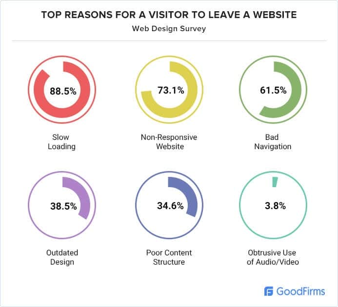
There are many different reasons why visitors choose to leave a website. However, almost all of them have something to do with web design.
Take poor loading speed, for instance. You’d think that no matter how bad the loading speed is, shopping online is still faster than browsing through supermarkets and shopping malls. But customers beg to differ.
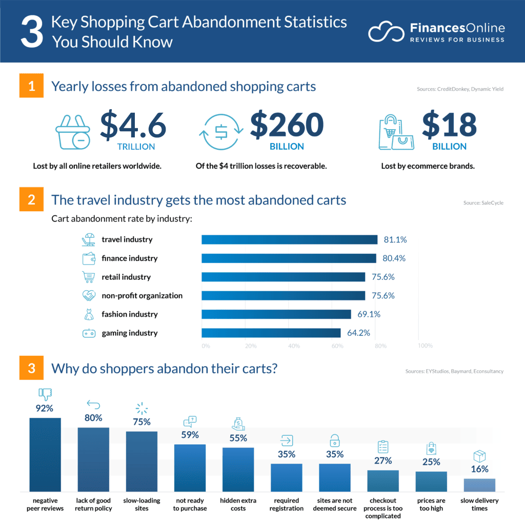
Poor loading speed alone is responsible for $2.6 billion lost in revenue each year.
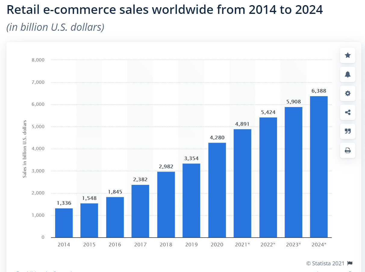
Sure this is peanuts compared to the overall eCommerce market size — a staggering $4.28 trillion (yes, with a T) in 2020 and bound to grow even more.
Peanuts or not, it hurts when your website participates in that loss.
60% of respondents in a Statista survey said that usability is important for them in an online shop.
Are there ways around a poor web design? Of course. You could, for instance, have the absolute lowest prices in your industry. You can sell with at least 50% less than your competitors do.
Then, perhaps, people would flock to your website and even wait an ungodly amount of time for it to load. But here’s the catch: you would only attract a certain type of customer. That customer would leave without looking back the second you increase your price.
More importantly, bad design is the safest way to lose consumer trust. Poorly designed websites turn on warning lights in your visitors’ minds. They know that online scammers don’t waste time and money on good design, so you may be immediately labeled as a scammer.
If that’s not enough, search engines will do that to you too. Search engines place great value on modern design and penalize outdated practices. You will drop so low in rankings you’ll have trouble finding your own website.
OK, enough doom and gloom. If you’re here, it probably means you’re neither a scammer nor someone who doesn’t care about design. So let’s see how you can improve your sales through great web design.
6 Overlooked Web Design Tips to Increase Your Online Sales
There is so much contradictory information online that it’s understandable if you don’t know where to start in designing a killer eCommerce website. Let’s shed some light on what matters and what doesn’t:
1. Keep Things Simple
I know. You want to promote so many things on the front page. Everything seems important: your mission statement, your visual brand identity and, of course, your promotions and star products.
Before you crowd them all together, let me show you something:
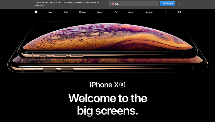
This is an older screenshot of the Apple website. There is one thing and one thing alone front and center. And would you look at the menu? It’s so simple that a four-year old could navigate it easily.
Apple has always been the world’s foremost example when it comes to clean, agile design. And for good reason. Almost everything they create is so easy to use that you fall in love with their products at first sight (or touch). Achieving this level of clarity often starts long before final design decisions are made. With an AI prototyping tool, teams can quickly experiment with layout structures and interface patterns, helping them identify what truly deserves the user’s attention. This makes it easier to simplify designs early and avoid unnecessary complexity that can hurt conversions.
Now how can you replicate that simplicity without making it look like scarcity (that’s the number one problem in trying to emulate the Apple feel)? Well:
- Make hard choices. Choose what to focus the visitor’s attention and stick to it. Too many promotions at the same time are hard to follow and irritating, no matter how big the deals you offer. Also, work with a company that provides Canva design service to ensure visually appealing promotional materials that effectively capture your audience’s attention.
- Create a simple and intuitive menu. No more and no fewer than the categories you need. You can add dropdowns to the major categories if need be, but measure that need carefully.
- Use simple, even common fonts. I know you want to stand out from a crowded crowd, but romantic fonts that are hard to read (especially on mobile!) will have you stand out in a bad way. Never sacrifice usability for untested design tricks. Also, don’t hesitate to use the best logo design software to ensure that your branding remains clear and easily recognizable across all platforms and devices.
- Sitck to a unified color scheme. What’s the latest on colors that sell? Is it green for the Buy button or was it blue this year? Should you really avoid red like the plague? While there are studies to support color choices (for instance, red inherently tells people to stay away), the one fashion trend that never goes away is a unified color scheme. If red is part of your brand identity and if it’s properly integrated with the other colors, people will click that buy button. Just don’t turn your website into a flowery carnival in an effort to incorporate all the colors that allegedly help you sell more.
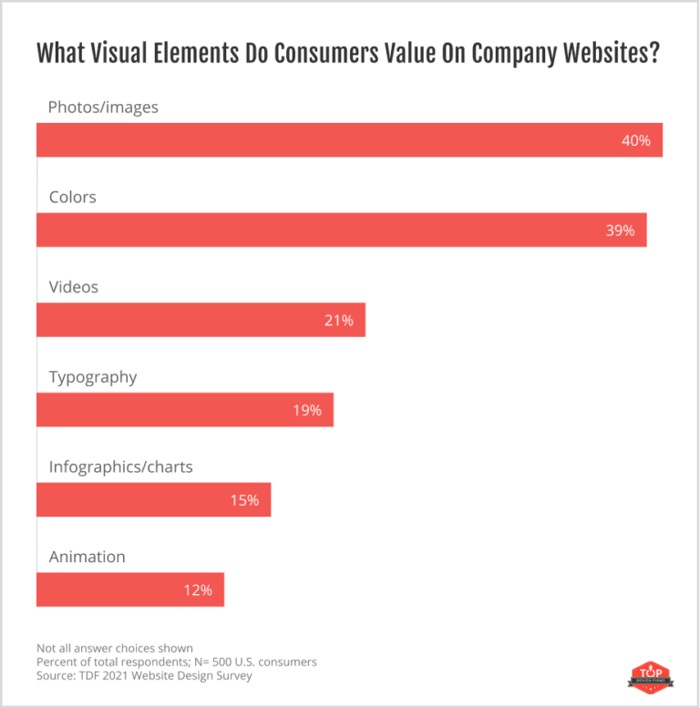
2. Use Clear Photos and Graphics
The right images can increase your conversion rate by up to 40%. Just look at the Apple screenshot above. What’s front and center? A stunning, high-definition vector image.
While videos seem to take over the world lately, in eCommerce design photos are still the most valued element.
The reason is fairly easy to guess: videos take time to watch. On mobile, they are often hard to pause and to enlarge. Great images, on the other hand, can offer all the details a customer needs.
Plus, bad, low-quality images convey insecurity. Why did you not post a clear photo of the product? Did you fear that visitors will notice product flaws?
Don’t give them an opportunity to ask these questions. Before anything else, invest in high-quality images and videos.
3. Create Customer Confidence
OK, your website is easy to navigate. It has the right colors in place. It’s an eCommerce dream come true from a visual point of view. So people will buy, right?
Sure they will. Right after they check if they can trust you. I mean, they have to trust you with their money, right. They won’t buy unless they know they won’t lose their hard-earned cash.
Reviews and testimonials are a great place to start in building trust. A word of caution, though: people know you can fake testimonials that are native to your website. To build extra trust, integrate your website with a third-party review website, like Google My Business. This way, you can pull independent third-party reviews.
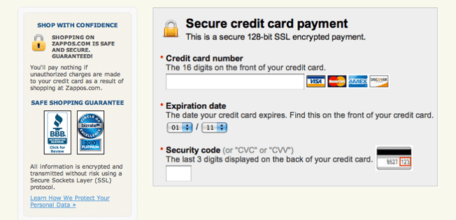
Step two and the most important one is to show you can be trusted with money. An SSL certificate is mandatory, of course. Along with a payment processing system that checks all the security boxes and people know they can trust. This can include a BNPL for business or a traditional payment system as long as it meets your needs and is secure. Something like this:
OK, you can be trusted with not stealing from buyers’ credit cards. But what happens if your product doesn’t meet expectations? Build extra trust through:
- A clearly stated return policy
- A term for refunds
- A timeframe for getting back to your customers that want to change or return an item.
4. Create a Simple and Clear Checkout Process
This is definitely one area you don’t want to overcomplicate. If customers have already added things to the cart, you don’t want them to abandon that cart now, right?
$4.6 trillion are lost because of cart abandonment.
We’ve covered some of the most common reasons for cart abandonment above. But 27% of consumers say that the reason they abandoned their cart was simply because the process was too complicated. You can avoid losing 27% of your customers through:
- A 1-step checkout process
- Avoid asking for too much information. Do you really need their birth date? Stick to the info you need to deliver the parcel and nothing more.
- Avoid too many extra offers. It’s OK to suggest one more complementary item they can add to cart with a single click. But if the checkout page is more crowded that your homepage, you’ll be in trouble. You can also take help from Chicago based web designers to help create perfect home and checkout page.
- Allow people to checkout as guests. Creating an account is often far too complicated for people on the run — and who isn’t on the run these days?
- Auto-fill the address and contact fields with the right data for people who already have an account with you.
5. Create a Perfect Balance of White Space
Balancing acts are always tough — in yoga and in web design. Too much white space gives the impression that your website lacks substance. On the other hand, overcrowding things is a bigger no-no.
For instance, how hard would you hit this pinata?
White space is your friend. Use it wisely. Allow the design and the user to breather. To avoid the bad design trap, utilize computer mockups to see the look and appearance of your website. The confusing mess above asks so much of your attention that you’d rather forego all the amazing deals they tout and pay full price just to stop your eyes from bleeding.
Care to imagine how this would look on mobile? I’d rather not. Speaking of mobile:
6. Optimize for Mobile & Loading Speed
Remember what we said above about poor loading speed being responsible for a few billion dollars in lost sales? Yes, it’s still one of the biggest pet peeves of the industry.
Check your current loading speed here. 1-2 seconds is the ideal load time, with up to 4 seconds in extreme cases. However, you should call your web developer as soon as you see anything above 3 seconds. Something in your design is making your website hard to load fast enough.
Lastly, but not less importantly, mobile optimization. It’s been said a million times, so I’m not going to insist here. The gist is pretty simple: if your website doesn’t work at least as good on mobile as it does on desktop, you’re in trouble.
53% of online shopping happens on a mobile. That’s more than half! Can you afford to lose more than half of your customers?
Wrapping Things Up
The web design field is often a victim of cargo cult. When someone says flat design is the way to go, almost everyone gets in line.
While having a fresh, modern look is essential, you don’t need to follow absolutely every trend out there. Just design with your customer in mind. Test as often as possible and redo what didn’t perform as expected.
Sometimes it’s that simple. It’s all about remembering the essential: you’re designing for your customers’ viewing pleasure, not for your executives and not in order to win a quirky design award. Focus on what matters to your bottom line.