How engaging is your website? Do people spend enough time on it to meet their goals (and yours)? Or do they leave as soon as they land? Is your content good enough? What about your UX?
There is one metric that can answer all these questions: bounce rate. Unlike other metrics, this one points to success when it’s as low as possible. One of the first indicators of success is high traffic volumes but a low bounce rate.
So today we’re going to help you reduce your bounce rate. Spoiler alert: you won’t have to do anything too complicated, but it will take some tweaking and testing.
First, a quick primer to help us set the scene:
What Is Bounce Rate?
Bounce rate is defined as the percentage of users who land on your website and leave without taking any further action, such as a click on a link, filling a form, or completing a purchase. In other words, they view the first page they land on (it’s not always your home page) and then close your website and move on.
Here’s another definition of bounce rate, this time straight from Google:
“A single-page session on your site.
In Analytics, a bounce is calculated specifically as a session that triggers only a single request to the Analytics server, such as when a user opens a single page on your site and then exits without triggering any other requests to the Analytics server during that session.”
Where can you find this metric and what does it look like? You’ll find it in your Google Analytics account (or in any other analytics solution you use). Here’s a quick screenshot to help you get your bearings:
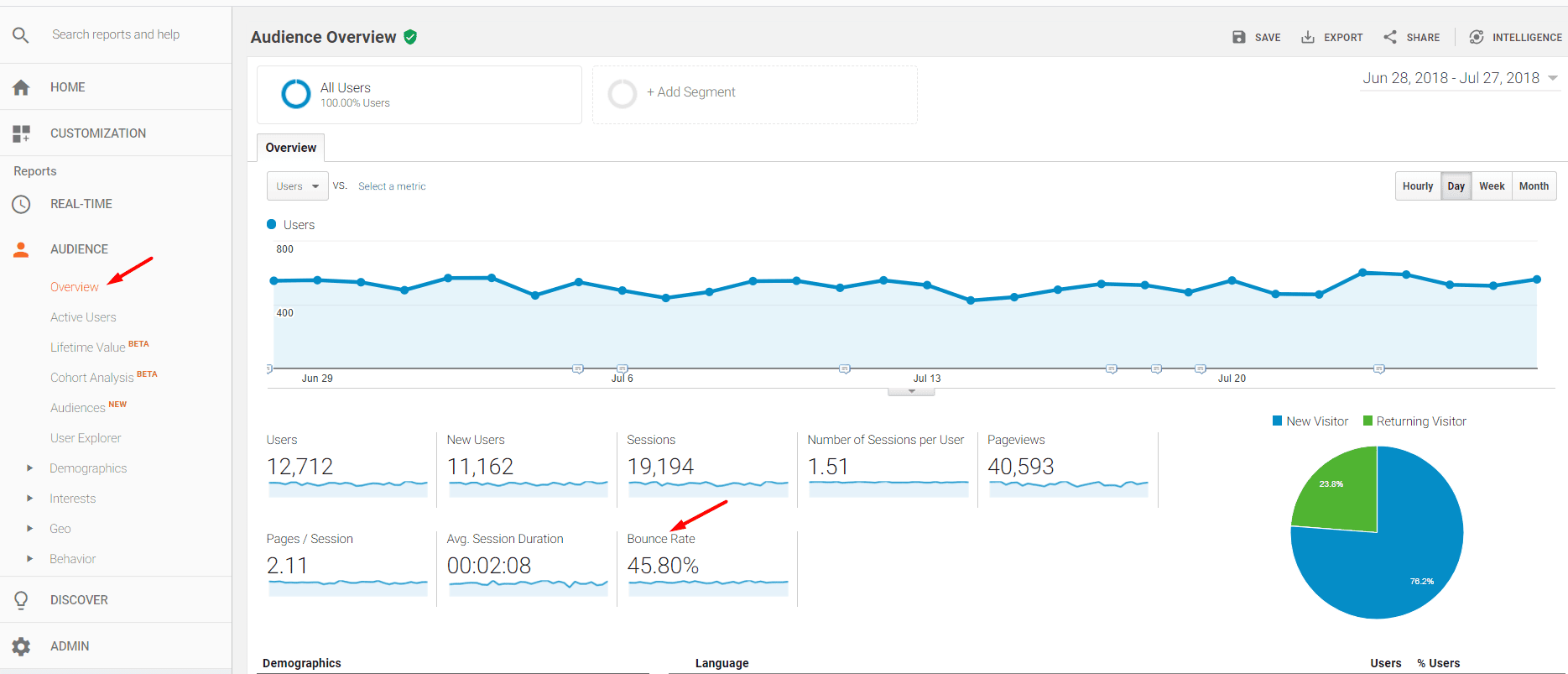
Image via Practical eCommerce
Why Should I Even Care about the Bounce Rate?
I know; there are countless metrics that seem more important than this one. Especially those at the bottom of the sales funnel, those that represent real “money talk”. But you can’t get to those without dealing with seemingly less important metrics first. I’m talking about the metrics that are usually associated with the top of the funnel, like bounce rate.
Thus, there are at least three reasons to work on reducing your bounce rate:
- Users that bounce don’t convert. See how it all ties to the money-talking metrics? You can’t talk about conversions if you didn’t get users’ attention long enough to even consider it. Reducing your bounce rate increases your chances of getting more conversions.
- High bounce rates are highly correlated to low Search engine rankings. It’s a new era, one where search engines want to deliver the best possible content to their users. When the algorithms “see” that one of your pages has a lot of bounces, they interpret this signal as your page not being good enough, at least for certain keywords. So it will rank lower and lower until you improve your bounce rate.
- A high bounce rate is the first signal that something is wrong. It can be your UX, your copy, or your content. Or your loading speed. Either way, something’s not going right and you should nip the issue in the bud.
Right, so a high bounce rate is bad. The next question to address is what is a good bounce rate?
Let’s dig into that, as there is no simple answer to this question. [Sorry, but this is online marketing, not an exact science. Although I swear, we like numbers too — you’ll see proof below.]
Bounce Rate Benchmarks — How to Spot a High Bounce Rate that Needs to Be Addressed
The average bounce rate is 41%-51%, according to GoRocketFuel. But this average tells us very little, so don’t despair yet if your bounce rate is much higher.
Bounce rates depend a lot on the industry you’re in. Here’s a quick overview:
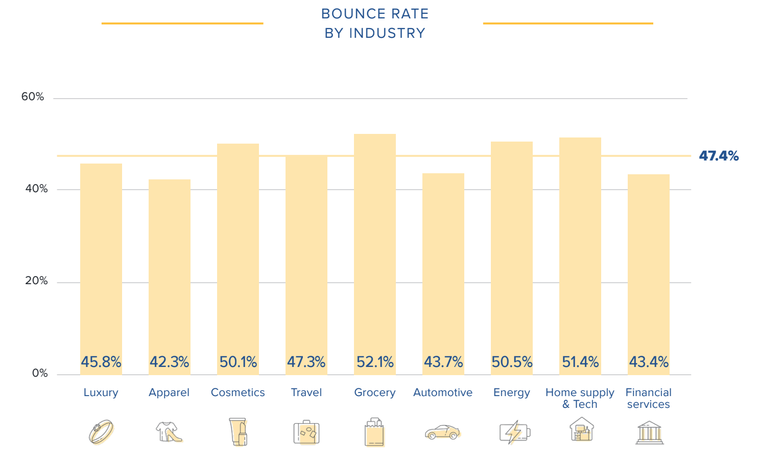
Image via Content Square
CXL has a more in-depth (and slightly different) analysis:
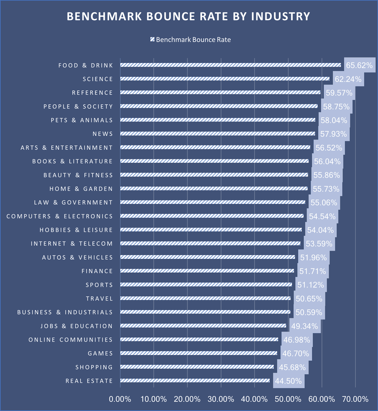
Image via CXL
Found your industry? Great! Save this first benchmark in your mind and let’s move on.
The best factor that influences bounce rate is the type of website you run. A luxury website, for instance, could be an eCommerce website or a blog. So yes, the type of content also matters.
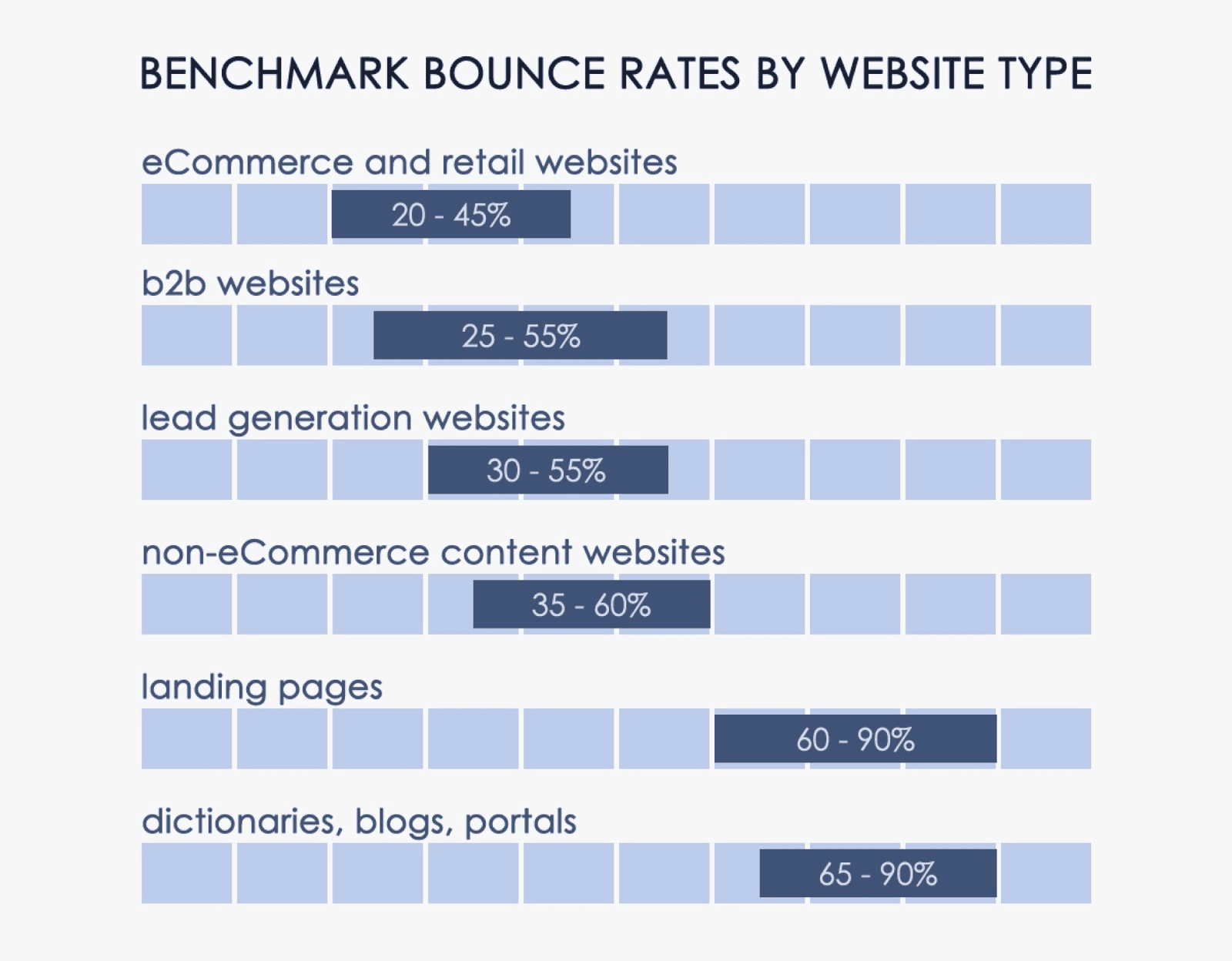
Image via CXL
Keep these distinctions in mind for the different types of pages on your website too. You should expect to see a higher bounce rate on your blog than in your eShop. [Please don’t shoot your blog writer, it’s not their fault, OK?]
Finally, we have one more significant factor to go through, the traffic source or the channel.
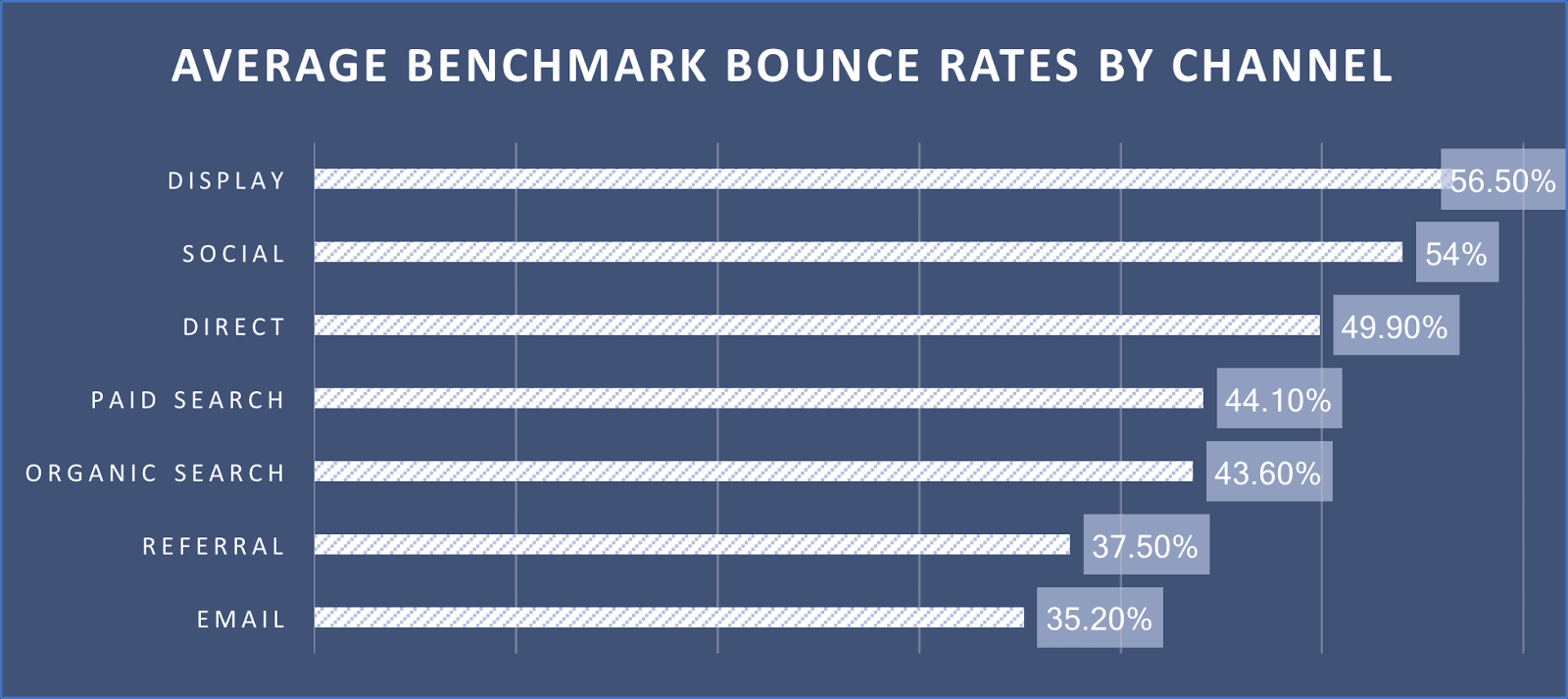
Image via CXL
As you can see, display ads have the highest bounce rate. Why? Because display ads are usually intrusive and most users click or tap on them by mistake. If you’re already in an industry with a high bounce rate, expect to see sky-high rates in this combination.
To these factors, add the device as well, although this criterion is starting to lose its importance. A few years ago, clicks by mistake from mobile were a much bigger issue, which resulted in a much higher bounce rate. But since we’re all mostly living on our phones these days, we’re grown more accustomed to them and these clicks are rarer. In other words, users have gotten better at avoiding intrusive ads.

10 Ways to Reduce Your Bounce Rate and Increase Your ROI
Even if your bounce rate is within industry and page type margins, this doesn’t mean there is no room for improvement. So let’s take a look at how you can reduce your bounce rate with a few simple tweaks and tests.
1. Check Your Page Loading Time
Users are impatient. If your page takes more than 4 seconds to load, there’s a good chance they’ll leave it. Ideally, you’ll want to keep it below 2.5 seconds.
In eCommerce, things are even direr. A 2-second extra loading time leads to an 87% increase in the abandonment rate.
Perform a loading speed test regularly. You can use this tool by Google, it’s completely free. And it comes with additional bits of wisdom, like this nugget here: “improving your load time by 0.1s can boost conversion rates by 8%.” An 8% increase in conversions is not too shabby, is it?
2. Optimize Your CTAs and Their Placement
Oftentimes, people leave a page because they don’t know what to do next. Think about this: your UX is great, your blog content offers all the information they need. But they’ve consumed and now they’re ready to move on.
This is a very easy fix. All you need to do is add the right CTAs in the right places. See what we did before this section started? We added a CTA for our services (you’ll see some more throughout this article).
Why?
Because not everyone reads everything. This is a long blog post. If you got this far, you already know that there’s more you can do on our website. More you can explore. We’ll keep reminding you of this.
Another way to keep people engaged with a blog is to link to articles on a similar topic. If they got there from a Google search, for instance, they may be interested to learn more about the same topic. This will not just reduce your bounce rate; it will also help every user get all the information you need.
A pop-up with gated content (access to high-value content that’s accessible after the user leaves their email address) is another great way to keep blog readers clicking and even turn them into leads.
For a web page, a landing page, even your contact page — don’t forget to add CTAs. Direct people to other pages or to sign up for your newsletter, at the very least.
Already have CTAs in place but they don’t really work?
Change their color, the copy, and their positioning. Again, this is not an exact science, so some testing is needed.
3. Is Site Search Easy to See and Use?
Not everyone finds what they need on the page they land. But they may search for it on your website.
Make sure you have a search bar in a clear and visible place — especially if you run an eCommerce store. This tiny improvement tells people they don’t need to click and scroll aimlessly. They can get to what they need quickly.
In the process, your bounce rate will be reduced and your users will be happier.
4. How Easy Is Your Site Navigation?
Remember the not-so-good days of that hamburger menu? You know, the tiny tiles that hid the actual menu?
I don’t know about you, but I’m extremely glad that time is over. Easy-to-find menus are back in style and they can do wonders for your bounce rate!
When you design your website, ensure that each menu section is clearly visible and that it has easily recognizable names. For instance, everyone knows what to expect of “Pricing” and “About us”. Don’t innovate these names unless you absolutely have to and if quirky is a brand statement for you.
5. Split Test Your Landing and Sales Pages
These are your most important pages. They bring in almost all the cash. So you need to be absolutely sure that they work flawlessly.
If you feel like your bounce rate could be improved on these pages but don’t know where to begin, do some A/B testing. The usual culprits are:
- Headlines
- CTA buttons and copy
- Colors
- Want to go even more in-depth? If you serve more than one country, try creating different pages for different countries. This way, you can leverage cultural insights even if they all stay in the same language.
6. Make Your Content Easy to Read and Easy to Skim
If users can’t find what they need at a glance, they will bounce. It’s your job to create content that’s easy to read and skim. Some of your best friends for easily skimmable or readable content are:
- Short paragraphs
- Bullet points (see what I did there?)
- A lot of subheadings so users can go directly to the section that is of interest to them
- White space
- Walls of text that are broken by images and videos.
Speaking of images and videos:
7. Use Various Types of Content to Keep Users Engaged
Different people respond to different things. Some prefer to read the information, while others prefer visuals.
Nobody prefers monotony, though.
This is why it’s always good to use more than one type of content, especially on your mission-critical pages. Photos and corporate video are always top-of-mind, but you can also experiment with infographics, for instance.
8. Leverage Social Proof
…or let your customers be your brand ambassadors. Bounce rates fall dramatically if regular copy or content is peppered with testimonials or reviews.
Everyone prefers to learn about a brand or a product from their peers, not from the brand itself. This is why everyone reads reviews:
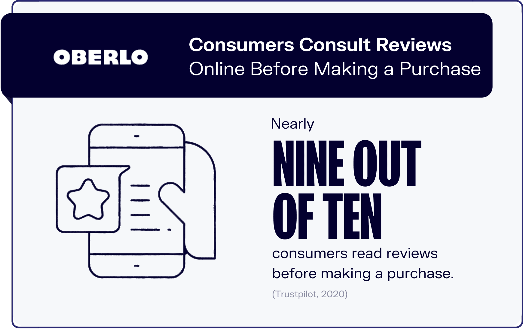
Image via Oberlo
Add links and embedded snippets of reviews or simply link to your success stories on as many pages as possible. It’s a great way to keep readers engaged and reduce your bounce rate.
9. Use the Right Traffic Sources (Check on Your PPC Campaigns Often)
If your traffic comes from PPC or display ads, for instance, a high bounce rate may be a signal that something is wrong with your campaign. Ideally, these ads would target the right people who would find the landing page interesting and buy your product or at least subscribe to your newsletter.
When that doesn’t happen, there are two things you need to investigate:
- Does your landing page deliver on the promise in the ad? For example, if you advertise highly discounted running shoes and the user only sees a 10% discount, you’ve got an obvious problem. The user feels tricked. So you either change the ad or the discount.
- If your page delivers on the promise, your problem may be the targeting. Users may be interested in your initial promise in the ad, but if they don’t like what they see on the page, they are not the right crowd for you. A mistake a lot of marketers make is targeting wide audiences. Try to narrow it down. Remember: no product is for everyone, so opt for quality traffic instead of generic, no-ROI traffic.
10. Proudly Display Your Credibility
Does your website look trustworthy? Oftentimes, in an effort to be creative, UX designers stray from the beaten path. And users don’t like to be taken out of their comfort zone. They especially don’t like pulling out their cards if a website doesn’t look and feel familiar.
But this doesn’t mean that you should sacrifice your creativity. You can show your credibility by displaying a few badges that are always synonymous with credibility and security:

Image via TBH Creative
Wrapping Things Up
Much like everything else in marketing, reducing your bounce rate is about knowing your audience. If you know their needs and wants, you will also know how to keep them engaged and happily click on your website.
When all else fails, go back to the drawing board and take another look at your buyer persona. Are your UX and content in line with their preferences? If you, you should see your bounce rate reduced after a few simple tweaks.


